

Heyy all! 👋
Today we are gonna learn What are CSS units and how to use them and there are 3 little challenges for you!
Let's get started!
Get Started!
About CSS Units!
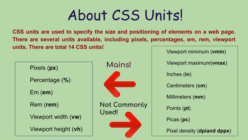
So, in total, there are around 14 CSS units that web developers can use!
We are not going to understand all of them but we're gonna the ones which are most commonly used in CSS...
Today we'll learn:
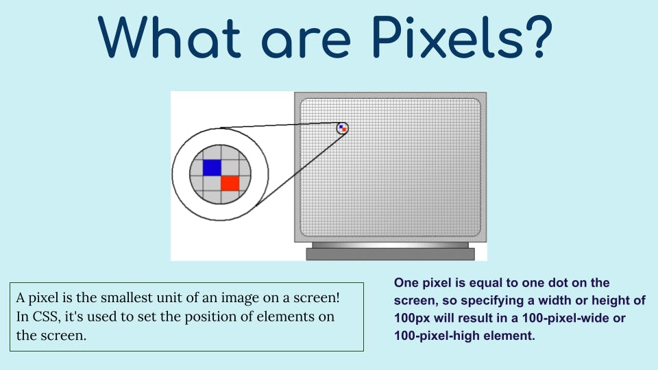
Pixels 👻
Let's understand this topic by code!
HTML code here! 👇🏻
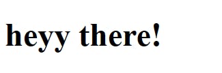
<div class="px">
    <h1>heyy there!</h1>
</div>
The output of HTML code!
CSS code here! 👇🏻
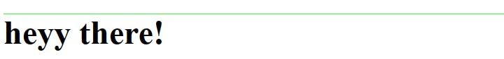
/* What are pixels in CSS? */

.px{
    height: 1px;
    background-color: lightgreen;
}
So I have settled the height of the div to 1px...And remember 1 pixel = 1 dot...
This is the height and it will be a straight line! Let me show you the OUTPUT...
Don't be confused It's easy for you! 😉
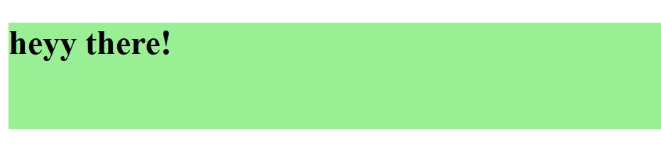
Let's set it to 100px and see what's the Output! 👇🏻
.px{
    height: 100px;
    background-color: lightgreen;
}
Output:
Hopefully, you are cleared with Pixels!

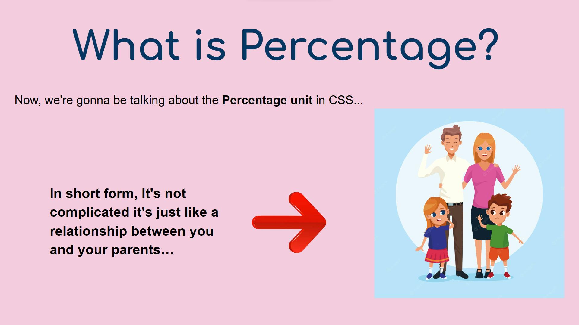
Let's Jump onto the Percentage (%) unit.
Percentage 💠
Without any further do let's jump into the example! 👇
HTML Code:
<!-- We've made 1 div and inside it we have another one, there are IDs too! -->

<div id="parents">
    <div id="child"></div>
</div>
- For now, we don't have any output...Coz these are empty DIVs, we are gonna apply the styles to explain to you guys!
CSS Code:
#parents{
    width: 100px;
    height: 100px;
    background-color:cornflowerblue;
}
- It's just halfway done and here's the OUTPUT:
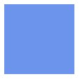
- We have a normal square with some color inside it!
Other DIV of CSS code:
#parents{
    width: 100px;
    height: 100px;
    background-color:cornflowerblue;
}

#child{
    width: 50%;
    height: 50px;
    background-color: lightblue;
}
- The Output will be 👇
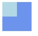
DO NOT WORRY ABOUT IT! 💥
HTML Code Explanation!
- We have made two DIVs and we have given them 2 unique IDs, one for
parentsand the other forchildto target and style them!
CSS code Explanation!
Firstly, I have targeted the
#parentsdiv and inside it, I have made a simple SQUARE with the same WIDTH & HEIGHT and added some background color.Now, we have targeted our
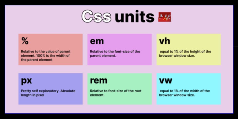
#childDIV...Inside it, we have set the WIDTH for 50%...Now the fun part arrives and what is % unit?Basically, Inside this #parents div we have set the width to 100px and what is the 50% of 100? Of course 50.
Similarly, 100px of 50% = 50px...
So, the WIDTH and HEIGHT turned into half of the square and it made a mini
square inside it!
Hopefully, you are cleared with PERCENT UNIT!

If you have any doubts mention them in the comments below and I will solve it for sure!
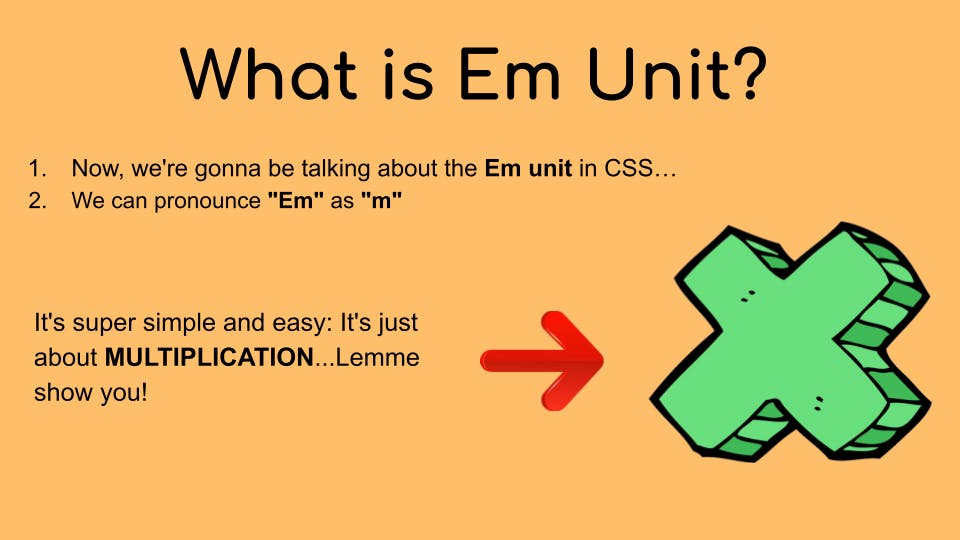
We have learned PIXELS & PERCENT UNIT...Now it's time to learn about the easiest unit in CSS and that is Em.
Em ⏳
HTML CODE 👇
<!-- We've made 1 div and inside it we have another one, there are IDs too! -->

 <div id="box1">box1
   <div id="box2">box2</div>
 </div>
- There is a
box1and inside it we'vebox2and we have named them as box1 and box2...
CSS CODE 👇
#box1{
    width: 300px;
    height: 300px;
    background-color:rgb(255, 146, 95);
    font-size: 20px;
}

#box2{
    width: 50%;
    height: 50%;
    background-color: rgb(250, 253, 104);
    font-size: 1em;
}
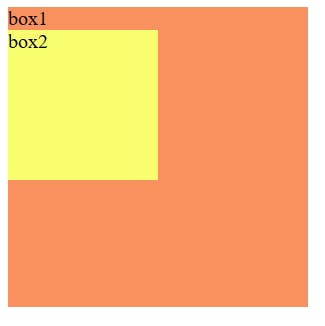
- In this 👆 case we've targeted our
box1and we've set thewidth: 300px;andheight: 300px;and added somebackground-colorIt's a normal square...After that, we set thefont-size: 20px;
👇
- Then we've targeted
box2and set the width to 50% of the box1's width, which is 150px same as the height of 150px. Added some background color and then our em unit arrives...What is 1em?
👇
How does em unit work?
In this case, EM is relative to its parent's font size like we have the font size as 20px so If I write box2 --->
font-size: 1em;then it'll be Multiplied by 1...What is 20 * 1 = 20px! Both sizes will be the same as 20px...
OUTPUT 👇
If I write 2em then it'll be 20 * 2 = 40px...
2 times the parent's font size...
The box1 will remain at 20px and box2 will be at 40px...
#box1{
    width: 300px;
    height: 300px;
    background-color:rgb(255, 146, 95);
    font-size: 20px;
}

#box2{
    width: 50%;
    height: 50%;
    background-color: rgb(250, 253, 104);
    font-size: 2em;
}
OUTPUT 👇
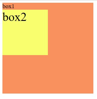
As you can see box 2's size is increased to 40px! It's Super easy!
Little Challenge:
- Set the font size of
box1to 30px and makebox 2's size is half of box 1's size In short you have to make box 2's size 15px...
Hopefully, you're clear with the EM unit in CSS!

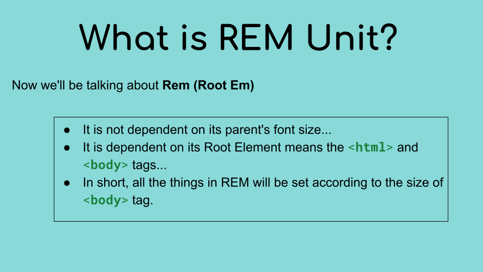
Rem 🎗
Let me show you the Example of Code!
HTML CODE 👇
<!-- We've made 1 div and inside it we have another one, there are IDs too! -->

 hello (16 px)
 <div id="box1">box1
     <div id="box2">box2</div>
 </div>
I've just written normal text inside the body tag...that is hello (16px)
You might wonder why I've written here 16px...Because If we write anything normal text inside the body tag it'll be always 16 pixels.
#box1{
    width: 300px;
    height: 300px;
    background-color:rgb(255, 146, 95);
    font-size: 20px;
}

#box2{
    width: 50%;
    height: 50%;
    background-color: rgb(250, 253, 104);
    font-size: 1em;
    width: 5rem;
}
- Everything is the same but I've added the width for 5rem
OUTPUT 👇
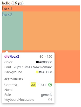
The Output is 80px, as you know we can Inspect by right-clicking the browser!
Why is it 80 pixels?
As I told you before that it's dependent on the
bodytag's font size...The font size in the body tag is 16px, so 16 * 5 = 80px
Hopefully, you are clear with the Rem unit!

Viewport Height (vh)
Let's take an example by code...
HTML CODE 👇
<!-- We've made 1 div and inside it we have another one, there are IDs too! -->

hello (16 px)
<div id="box1">box1
    <div id="box2">box2</div>
</div>
CSS CODE 👇
#box1{
    width: 300px;
    height: 300px;
    background-color:rgb(255, 146, 95);
    font-size: 20px;
}

#box2{
    background-color: rgb(250, 253, 104);
    font-size: 1em;
    width: 5rem;
    height: 1vh;
}
OUTPUT 👇
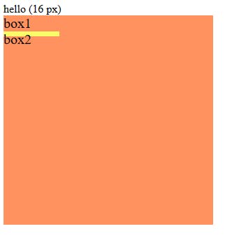
This is 1vh means 1% of the height of the browser...
Hopefully, you are cleared with it!

- Little Challenge! 🚀--- I challenge you to set the height of the browser to 50vh...And after you complete the challenge you have to share it on Twitter!
My Twitter account: Click here!
Viewport Width (vw)
Let's take an example by code...
HTML CODE 👇
<!-- We've made 1 div and inside it we have another one, there are IDs too! -->

<div id="box1">box1
    <div id="box2">box2</div>
</div>
CSS CODE 👇
#box1{
    width: 300px;
    height: 300px;
    background-color:rgb(255, 146, 95);
}

#box2{
    width: 50vw;
    background-color: rgb(250, 253, 104);
}
OUTPUT 👇
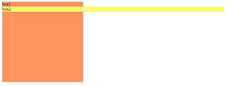
This is 50vw means 50% width of the browser...
Hopefully, you are cleared with it!
- Little Challenge! 🚀--- I challenge you to set the height to 50px...And the width of the browser to 100vw...And after you complete the challenge you have to share it on Twitter!
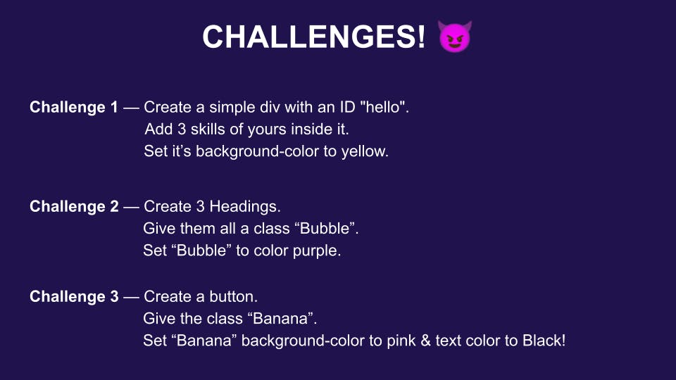
Challenges!
So, that is it so today everyone! And I'll meet you guys in the next one!
See ya! 💛