


Table of contents
heyy all!
This is Amena and today we're gonna learn about Rem Unit in CSS!
Rem 🎗
Now we'll be talking about Rem (Root Em)
What is Rem?
It is not dependent on its parent's font size...
It is dependent on its Root Element means the
<html>and<body>tags...In short, all the things in REM will be set according to the size of
<body>tag.Let me show you the Example of Code!
HTML CODE 👇
<!-- We've made 1 div and inside it we have another one, there are IDs too! -->

 hello (16 px)
 <div id="box1">box1
     <div id="box2">box2</div>
 </div>
I've just written normal text inside the body tag...that is hello (16px)
You might wonder why I've written here 16px...Because If we write anything normal text inside the body tag it'll be always 16 pixels.
#box1{
    width: 300px;
    height: 300px;
    background-color:rgb(255, 146, 95);
    font-size: 20px;
}

#box2{
    width: 50%;
    height: 50%;
    background-color: rgb(250, 253, 104);
    font-size: 1em;
    width: 5rem;
}
- Everything is the same but I've added the width for 5rem
OUTPUT 👇
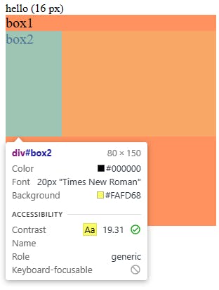
The Output is 80px, as you know we can Inspect by right-clicking the browser!
Why is it 80 pixels?
As I told you before that it's dependent on the
bodytag's font size...The font size in the body tag is 16px, so 16 * 5 = 80px
Hopefully, you are clear with the Rem unit!

See ya! 😉